Monday Mar 18 2024 03:23

9 min

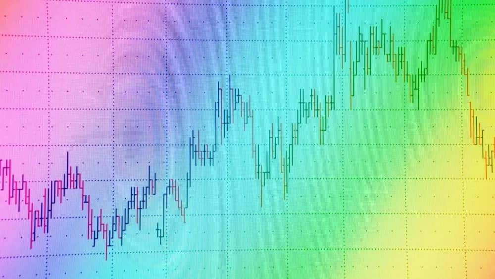
Making profitable decisions in volatile markets requires seeing patterns that others may miss. One tool that helps uncover such insights is the rainbow chart, a technical analysis indicator using colours to map bull and bear cycles.
In this guide, we'll explore how rainbow charts are constructed and interpreted. You'll learn to spot opportunities by analyzing changing colours, helping time your entries, and existing for the potential to achieve favourable risk-adjusted returns over time.
The basic components of a rainbow chart are straightforward. It only requires historical price data for the asset or index you want to analyze and a chosen period for the simple moving average (SMA). The most commonly used SMA periods for rainbow charts are 50 and 200 days.
To generate the coloured bands on the chart, each period is measured against the SMA and categorized as being either above (green), below (red), or within a predefined range around (yellow) the SMA value.
Green periods indicate prices are trending up and above the SMA, red shows downtrends as prices fall below, while yellow flags consolidation or sideways markets as prices bounce around the SMA.
By tracking the preponderance of green, red, or yellow over time, rainbow charts paint a vivid picture of the prevalent trend - whether upward (bull), downward (bear), or sideways (range-bound).
Lots of green suggests a strong bull market is underway. Deep red signals a bear market that may persist. When colours are mixed, it points to a more uncertain environment.

One of the most valuable features of rainbow charts is their ability to signal potential trend changes before they are confirmed on price charts.
Look for instances where the dominant colour starts giving way to increases in another hue.
For example, a long-running green bull market may begin tilting more yellow as the upside momentum wanes. Sustained periods of yellow could foreshadow an incoming macro top. Similarly, the persistence of red in a bear phase may give way to yellow hopium before prices embark on a new upswing.
Skilled traders can time their entries for reversals ahead of the crowd by monitoring the relative balance of colours. Exiting positions before a dominant colour fades too much is also advisable to reduce downside risk.
In this way, rainbow charts act as a forward-looking overview of sentiment shifts.
This article may pique your interest: Understanding The Chaikin Money Flow Indicator
Another hallmark of rainbow charts is their ability to map complete bull-bear-bull cycles from start to finish.
A typical bull cycle often begins with a prolonged period of yellow as prices consolidate below resistance. A sharp breakout of green then follows this as demand overwhelms supply. The green phase persists as each new high finds fresh buyers, extending the advance.
Eventually, the rate of new highs starts decelerating, with more time spent range bound around the SMA in yellow. This is a warning sign the bulls are tiring.
If selling accelerates and breaks below support, the dominant colour flips to red, signifying a bear market is underway.
From here, the red ink piles on as each new low shakes out more holders. Capitulation sets in after an extended down move. Another prolonged yellow phase ensues as sellers exhaust themselves.
Finally, the first green bar in a while validates an emerging floor, from which a new bull cycle may launch over the coming months and years.
Learn more by checking out this useful article: Guide to Support and Resistance Trading
Now that we understand the basic mechanics of rainbow charts, let's discuss some practical trading strategies for their implementation:
Focus on major assets: Rainbow charts work best with liquid indexes tracking broad markets rather than individual stocks due to higher data reliability. S&P 500, NASDAQ, DJI, etc., are good candidates.
Match timeframes: Use weekly or monthly charts for a macro overview. Daily charts for active traders. Higher timeframes paint a more complete cycle.
Combine with indicators: To enhance the accuracy of trend analysis, it's recommended to integrate rainbow charts with momentum indicators such as the Relative Strength Index (RSI). This will enable you to validate the trend's strength and make better trading decisions.

Combining volume analysis with momentum indicators can also help spot potential divergences, strongly indicating a trend reversal.
Set price/SMA parameters: Most use a 50-200 day SMA, with +/- 5-10% bands. Test different settings to optimize results for your preferred markets.
Pay attention to trend changes: Watch for changing colour balances as leads rather than lagging confirmation on price charts—time entries around reversals.
Use pullbacks to increase exposure: One strategy for trading is to increase one's holdings when there are temporary pullbacks within the current trend.
However, it's important to be cautious and reduce risk as the colours mix and resistance approaches. This can help to maximize profits while minimizing potential losses.
Set profit targets: When trading, it can be helpful to partially exit a position if there is a test of a trendline after a strong move. This can help secure profits while still allowing for potential further gains.
Additionally, it is essential to fully exit a long position before the dominant colour erodes too much. This can help minimize losses and protect against a potential trend reversal.
You might also like to read: Role of Charting Software in Market Analysis
Rainbow charts offer a simple yet insightful way to visualize market trends and cycles using colour-coded history. Their ability to spot inflexion points in real time is a valuable complement to traditional technical analysis.
This trading indicator can help traders identify high-probability entries, manage exposure through cycles, and achieve more favourable risk-adjusted returns over time when used with confirmation from other indicators and careful risk management.
With some practice, this colourful visualisation can become a trusted guide on your trading journey.
Learn and trade with markets.com: The ultimate trading community!
“When considering “CFDs” for trading and price predictions, remember that trading CFDs involves a significant risk and could result in capital loss. Past performance is not indicative of any future results. This information is provided for informative purposes only and should not be considered investment advice.”